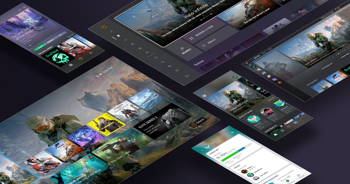
Earlier this month, Microsoft began testing a new user interface for its Xbox Series X/S and Xbox One consoles. He specifically focused on home screenwhich you see immediately after turning on the console and which we use most often.
A very limited number of users were selected for this testing. Microsoft is changing its UI on Xbox notoriousso this time he intends to implement changes very slowly and carefully.
However, the reviews so far have been quite negative, and he commented on them himself at the Tokyo Game Show. Major Nelsonwho is working on these changes.
“We do not even expect to be able to send something to everyone before the end of this year. And then we will further evaluate the feedback we receive and decide how to proceed based on it.”
While the changes are not a complete failure, they are definitely not popular. Players mostly complain that new interface covers too much background and you can’t see the wallpaper you have set.
“The feedback we got during testing was that the top row covers the dynamic background a little more than some would like, and I can understand that. So we set up a meeting for tomorrow where we will look at all of this feedback and start discussing how we’re going to deal with it.”
Source: Microsoft Microsoft wants to make Xbox a major player
Another point of criticism is how much is actually on the screen. Players they don’t know how to navigate quickly and a lot of offered tiles with content seem unnecessary to them. Whether it’s an Xbox Game Pass warning, a Microsoft news blog, or upcoming games.
To add my personal opinion to the discussion as well, I must say that I have a similar problem with the current Xbox interface. Whereas on the Playstation I have all the options nicely lined up at the top, on the Xbox they are laid out in a grid layout and I often have to click the next menu to get to what I’m looking for. Unfortunately, I do not think that the new planned interface will somehow solve this problem, but at the same time, I would not say that this is a shift for the worse.
Ivy Chrislov, who also has a large stake in the upcoming UI, commented on the suggested content.
“For customers who use the console to watch TV, for example, we will add multimedia capabilities. Another thing we want to address (most likely as part of the third test) is to take the game blocks that customers already pin at home and change them to look more like a new version of our interface. We also hope to add more information to these blocks.”
However, I’m personally not sure. if you need even more information on the main page. Personally, I hardly use the various achievements and social features, and these options only create visual clutter for me, which makes it difficult to quickly navigate the interface.
Source :Indian TV

